GLENT bakery
Brand identity
| About
Glent is a new local bakery from Belgium. The company specializes in a narrow range of breads. It is made using traditional methods and high quality ingredients sourced from local farmers, resulting in superior flavor and texture. Glent's philosophy is based on the essentials - they place a high value on quality products. When you stop in for bread in the morning, you'll be able to take a cup of coffee with you.
| Solution
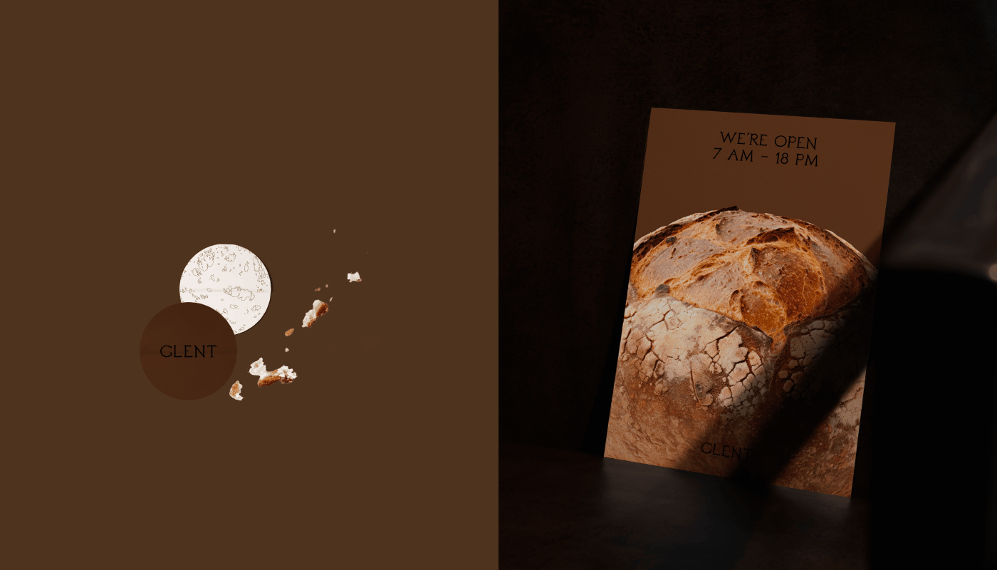
The color palette and serif font denote the tradition and true representation of the bakery, while the modern layout and graphic elements emphasize the company's flexibility. Visual accents - cut-out images of bread crumbs and an illustration of the texture of the bread, reinforce contact with the product. The consistency of the design builds a foundation of brand recognition.
Associations: classy, modern, recognizable.
Tags: bakery, bread, packaging, stationery.